🧾 Introduction
CardView is one of the most elegant UI components in Android. It’s perfect for displaying lists, product cards, profiles, notifications, and much more. It provides elevation, rounded corners, and a material look out of the box.
In this article, we’ll explore 10+ beautiful CardView designs you can use directly in your Android XML layout.
🔧 Step 1: Add CardView Dependency
✅ Also make sure you use MaterialTheme in your app theme.
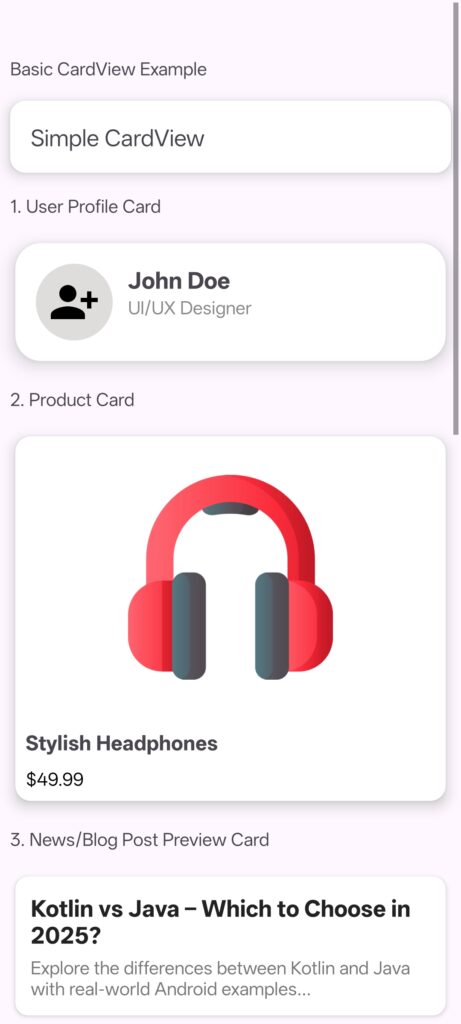
🧱 Basic CardView Example
💡 10+ Creative CardView Layout Examples
1. User Profile Card
Create Drawable circle_bg.xml
📦 2. Product Card
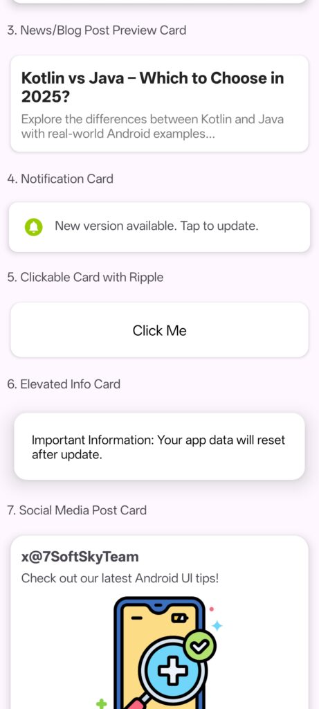
📰 3. News/Blog Post Preview Card
🔔 4. Notification Card
🎯 5. Clickable Card with Ripple
📘 6. Elevated Info Card
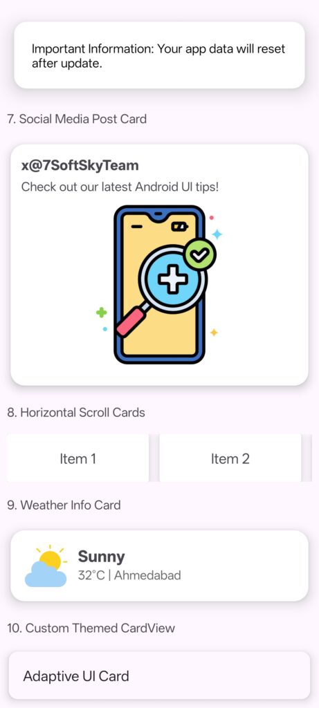
📱 7. Social Media Post Card
🎢 8. Horizontal Scroll Cards
🌤 9. Weather Info Card
🎨 10. Custom Themed CardView
CardView Design Screenshot
📌 Best Practices for CardView Design
- Use
cardElevationfor shadow depth - Keep padding consistent inside card content
- Use rounded corners (
cardCornerRadius) to match modern UI - Always test on light & dark themes
🧰 Use Cases
| Use Case | Example |
|---|---|
| Product listing | eCommerce UI |
| User profile | Contacts or Team List |
| Notifications | System alerts or updates |
| News/blog preview | Feed or article summaries |
| Settings tiles | Modern settings screens |
🔚 Conclusion
CardView is a powerful UI building block for any Android app. With just a few lines of XML, you can create highly engaging and professional layouts. Try integrating the above templates into your app today!
